A Call To Action (CTA) is a message, usually in the form of a button or hyperlink, that guides website visitors to take the appropriate next step, whether it’s booking a call or reading an article, and eliminate confusion. CTAs can take many forms, such as “Sign Up” or “Buy Now,” and are designed to guide the user to the next step in the sales funnel.
CTAs are crucial for improving user engagement and conversion rates. Without a clear and compelling CTA, users may leave the site without taking any action. A well-crafted CTA removes friction in the user journey and provides a clear direction for potential customers.
Where to include CTAs?
To effectively use CTAs in your marketing campaigns, consider implementing them on various websites that your target audience frequents. Some of the places where you can include CTAs are:
- Your website: Ensure that your website has CTAs in different sections, such as the homepage, to provide visitors with multiple opportunities to click through and make a purchase. Additionally, incorporate CTAs in your blog posts to attract more traffic to your site.
- Email campaigns: Utilize your email list to send an email blast to your subscribers, and include CTAs within the email’s body.
- Social media: Place sponsored ads on social media platforms like Facebook, which offers a “Learn more” button for companies to include with their CTAs.
- Search Ads: Sponsored ads on Google that will appear when users search for your products or services. Include your phone number in the ads, and Google will provide a click-to-call button on mobile devices, making it easier for potential customers to contact you.
How does a successful Call To Action look like?
A successful call to action (CTA) is concise, captivating, and motivates the audience to click through to your website. To create a strong CTA strategy, consider incorporating these six key elements:
Use an imperative tone
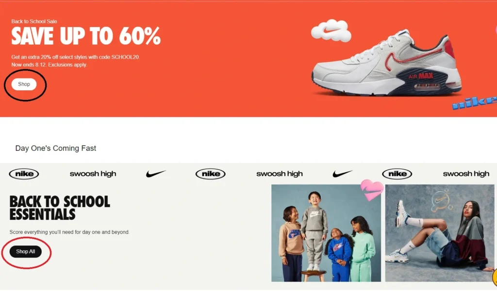
A CTA aims to persuade people to take action, so use strong, action-oriented language like “shop,” “join,” or “click” to direct your audience.
Lower the risk.
Your CTA should offer high value but low risk for your audience. Emphasize that they can learn more without committing to anything, using a zero-pressure approach.
Employ persuasive writing techniques
To make your CTA compelling, use persuasive language and keep the copy concise to pique the audience’s interest. Also, offer a value proposition such as a money-saving incentive.
Create urgency
A sense of urgency can be a powerful motivator. Consider using phrases like “limited time offer” to create FOMO (fear of missing out) and prompt people to act quickly.
Make it visually appealing
A well-designed CTA that stands out on the page can capture your audience’s attention. Use white space around the button and bright colors to make it pop.
If you are looking for specific examples, you can check out this blog post.
The importance of A/B testing for optimizing your Call To Action
A/B testing allows you to experiment with different CTA copies, their placement on the web page, size, color scheme, and more.
Through such experimentation, you can determine which variation has the highest potential to generate sales. By measuring the conversion rate of each CTA, marketers can optimize their messaging and improve engagement with their audience.
Discover how to set up an A/B test by clicking here.


Pingback: How to Grow your Small Business with Marketing - Digital Marketing for Growth
Thank you for your sharing. I am worried that I lack creative ideas. It is your article that makes me full of hope. Thank you. But, I have a question, can you help me?