In today’s digital world, you need to take into consideration website design best practices. In fact, having a user-friendly website is crucial for businesses to attract and retain customers.
This is where User Experience (UX) design for your Website comes into play. Website design is the process of designing a website or an application that is easy to use and provides a seamless experience to its users.
UX design is not just about making a website look good but also about creating a website that is functional, efficient, and enjoyable for users to interact with. Here are four UX design best practices that can help improve conversions on your website.
1. Above the Fold Call-to-Action as Website Design Best Practices
The content that appears on a website without requiring visitors to scroll is known as “above the fold” content.
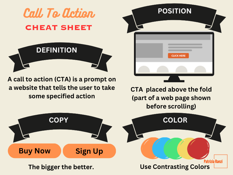
This content is designed to attract the most attention from visitors since it’s the first thing they see when they load the page. According to best practices, it’s recommended that your call to action be placed above the fold since visitors usually don’t scroll beyond it.
However, it’s important to note that users only engage with content below the fold if they find the above the fold content sufficiently compelling. Even in such cases, the majority of their time is still spent above the fold, as per the results of eye-tracking studies.
Upon analyzing the websites of two top companies, Apple and Nike, it’s apparent that they repeatedly use the phrases “Shop Now” to encourage consumers to take action and slogans about their latest offers to engage visitors.
These repetitions are made multiple times in the above the fold section of their websites.


2. Optimize for speed and performance as Website Design Best Practices
Walmart found that for every 1 second improvement in page load time, conversions increased by 2%.
Even seemingly minor improvements in conversion rates can significantly impact a website’s revenue. In this case, a one-second improvement in load time resulted in a 2% increase in conversion rate, leading to a $2,000 increase in revenue for a site generating $100,000 in sales annually. Milliseconds matter.
Optimizing your website for speed and performance can help improve the user experience and reduce the bounce rate. This can be done by compressing images, minimizing the use of plugins, and optimizing the website’s code.
In addition to enhancing user experience, site speed is a critical ranking factor in the broader field of search engine optimization.
3. Ensure mobile responsiveness as Website Design Best Practices
Consumers are increasingly choosing mobile commerce as their preferred shopping channel. According to a study published by Shopify, with retail m-commerce sales reaching $359.32 billion in 2021, a 15.2% increase from 2020.
It’s predicted that by 2025, retail m-commerce sales will more than double to reach $728.28 billion, accounting for 44.2% of all retail ecommerce sales in the United States.
Therefore, it is crucial to ensure that your website is mobile-responsive. This means that the website should be optimized for different screen sizes and resolutions to provide a seamless experience across all devices.
A mobile-responsive website can help improve user experience and increase conversions, as users are more likely to engage with a website that is easy to use on their mobile devices.
4. Simplifying Navigation for Better Landing Pages as Website Design Best Practices
For websites and landing pages alike, the ultimate goal is to convert visitors into customers. However, excessive clutter in the form of navigational links can be a major obstacle to achieving this objective.
When visitors are presented with too many options to click away from the landing page, it can undermine the page’s purpose and decrease conversion rates.
Thus, an option is to remove all the distractions from the above the fold section of the site and create a “naked landing page.” This allows visitors to focus solely on the offer and complete the conversion by filling out the form without any interruption.
Uber Eats is a great example of a startup that uses a simple, effective website design to drive conversions. The website is focused on one main goal: getting visitors to enter their delivery address and search for delivery options.
Despite having additional minor menu options available in the hamburger icon on the right and a sign-in/sign-up option on the opposite side, the website’s main focus remains on its central objective. This streamlined approach is also used by several successful startups to keep their websites clean and efficient.

Conclusion
In conclusion, UX design plays a crucial role in improving conversions on your website. By following best practices, you can create a website that provides a seamless experience to its users and helps drive conversions. Check out an article on how to boost growth by using other tactics!
And since you managed to get to the end of the article, I have a little bonus for you. Here is a Call To Action Cheat Sheet for you!


Pingback: How to Grow your Small Business with Marketing - Digital Marketing for Growth
Your point of view caught my eye and was very interesting. Thanks. I have a question for you.